|
|
|
Let’s look at an
example from the Attendance Page:
|
|
|
|
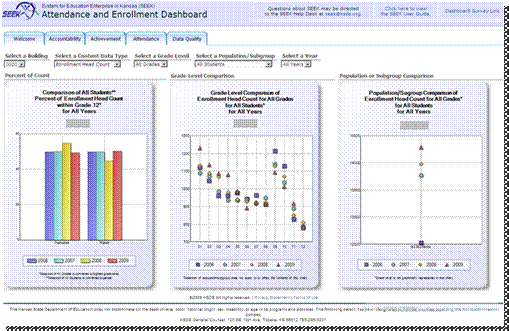
The Attendance
Page displays attendance and enrollment measures across time for the district
and/or its schools. The first chart is split by gender. The left chart is a
Percent of Count Chart and it displays a comparison of the percent of student
population counts within of all grades over time.
|
|
|
|
SEEK will put
Administrators in charge of how their data is displayed. Let’s look at an
example from the Attendance page: Note the filters can be used to change what
data is displayed.
|
|
|
|
The center chart
shows that you can drill down interactively to a selection of a single school
demonstrating dynamic filters. The middle chart is a Grade Level Comparison
Chart and it displays a comparison of selected content data type across time.
|
|
|
|
The far right
chart indicates Population or Subgroup Comparison and it displays comparison
of selected content data type across time, notice the rise in enrollment from
2006 to 2009 in this example. This chart also makes it easy to see the
greatest rise occurred between 2006 and 2007.
|
|
|